
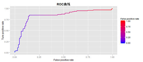
为了进一步了解ggplot2的使用,利用ROC曲线进行说明学习。
####获取画图数据(data.frame格式)#####
library(ggplot2)
library(ROCR) ##用于计算ROC
data(ROCR.simple) ###画图数据集
pred <- prediction(ROCR.simple$predictions, ROCR.simple$labels)
perf <- performance(pred,"tpr","fpr")
x <- unlist(perf@x.values)  ##提取x值
y <- unlist(perf@y.values)
plotdata <- data.frame(x,y)
names(plotdata) <- c("x", "y")
#####画图###############
##先确定映射图层geom_path,labs层修改标题,scale_colour_gradient层修改图例(为何是这个看2.0),theme层精细修改标题。##
g <- ggplot(plotdata) +
  geom_path(aes(x = x, y = y, colour = x), size=1) +
  labs(x = "False positive rate", y = "Ture positive rate", title ="ROC曲线") +
  scale_colour_gradient(name = 'False positive rate', low = 'blue', high = 'red') +
  theme(plot.title = element_text(face = 'bold',size=15))
g
附上原版ROCR包自带的图和ggplot2的图进行对比: 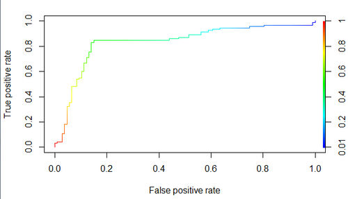
点击查看更多内容
为 TA 点赞
评论
共同学习,写下你的评论
评论加载中...
作者其他优质文章
正在加载中


感谢您的支持,我会继续努力的~
扫码打赏,你说多少就多少
赞赏金额会直接到老师账户
支付方式
打开微信扫一扫,即可进行扫码打赏哦