
第一板块:六个案例学会响应式布局,第一章;第二章,大谷
第二板块:
什么是媒体查询(media)?(移动端使用较多)
为不同尺寸的屏幕设定不同的css样式。
media的常用参数
width,height-浏览器的可视宽度,高度
device-width,device-height-设备屏幕的宽高
媒体查询其他引入方式
1.写在style标签中,有条件的执行某个内部样式表
<!DOCTYPE html>
<html>
	<head>
		<meta charset="utf-8">
		<title></title>
		<style type="text/css">
			#divDom{
				width: 100px;
				height: 200px;
				background-color: aqua;
			}

		</style>
		<style type="text/css" media="(min-widht:200px) and (wax-width:500px)">
			#divDom{
				background-color: mediumpurple;
			}
		</style>
		<style type="text/css" media="(min-widht:501px) and (wax-width:800px)">
			#divDom{
				background-color: aquamarine;
			}
		</style>
	</head>
	<body>
		<div id='divDom'></div>
	</body>
</html>2.link引入,写在link标签中,有条件的引入外部样式表
<link rel="stylesheet" href="./111.css" media="(min-widht:200px) and (wax-width:500px)" />
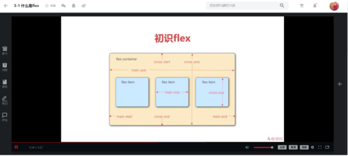
4.什么是flex布局?
flexableBox是弹性盒子,用来进行弹性布局,可以配合rem处理尺寸的适配问题。
flex的优点:
1.用来为盒模型提供最大的灵活性。
2.更加符合响应式设计的特点。
第三板块:
注意:媒体查询and两边都需要存在空格。
// 媒体查询的代码演示
<!DOCTYPE html>
<html>
	<head>
		<meta charset="utf-8">
		<title></title>
		<style type="text/css">
			#divDom{
				width: 100px;
				height: 200px;
				background-color: aqua;
			}
			/*屏幕宽度的处理*/
			@media screen and (min-device-width:200px) and (max-device-width:300px) {
				#divDom{
					background-color: aquamarine;
				}

			}
			@media screen and (min-device-width:301px) and (max-device-width:500px) {
				#divDom{
					background-color: deepskyblue;
				}

			}
			/*浏览器宽度的处理*/
			@media screen and (min-width:501px) and (max-width:600px) {
				#divDom{
					background-color: red;
				}

			}
			@media screen and (min-width:601px) and (max-width:800px) {
				#divDom{
					background-color: blue;
				}

			}
		</style>
	</head>
	<body>
		<div id='divDom'></div>
	</body>
</html>
第四板块:
点击查看更多内容
为 TA 点赞
评论
共同学习,写下你的评论
评论加载中...
作者其他优质文章
正在加载中


感谢您的支持,我会继续努力的~
扫码打赏,你说多少就多少
赞赏金额会直接到老师账户
支付方式
打开微信扫一扫,即可进行扫码打赏哦